Considerations Before Choosing Color Palettes For Your Mobile App Design
In the app development to make the app more successful, it must have a good app design, it involves User interface(UI) and User Experience(UX). The perfect UX and UI provide the app with success. To make a perfect this you must consider choosing color palettes, without this even you have cristal cut UI and UX your design lags behind.

What is color palettes?
It is a range of colors that you going to use in your mobile app development, which includes a color for text, icon, layout, background, and etc. The color palettes are to be determined during the app development processes.
Importance of color on app design
1.The color gives a visual idea of your app- for example, if you wish to have a camping app the icon must have palettes of green and brown. These colors give the look of nature, etc.
2. Emotion makes the decision and colors affect the emotions – the color of your influences the people and may alter emotions.

Basic outlook of color palettes
1. Warm colors
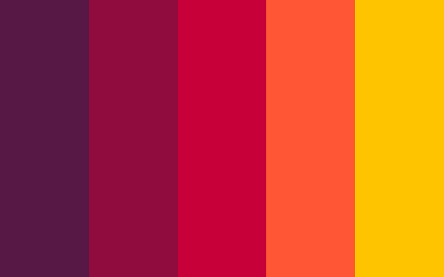
The warm colors are been used to make a closer look, which may make the users think about warm things. The major warm color involves Orange, Red, Yellow, and their combinations.
2. Cool colors
This colure brings the user’s calming effects with its smoothing tone of nature. The major cool color involves blue, green, purple and the combination of it
3. Neutral colors
It is also called as background color, many colors in the design are neutral colors. The neural color has a property of realistic lighting effet major neutral colures involves Black, White, gray, and many near-neutral colors.
Primary colors
It must be the most displayed colors to be used in your App UI element. The contrast between UI can be created easily by using the light and dark variant of the primary colors .it can be used for distinguished UI elements such as a hover, floating button, Incon indie it.
Secondary colors
It must act as an alternative color and may be applied in a selected part od your UI. This is mostly well suitable for floating buttons, sliders, switches and for syntax highlighting in your app

Color palettes stake/resource
Conclusion
The successful color patterns palettes successful app development. To make good color patterns you need to choose the colors according to the above basics where the primary color must be the most seen one.


