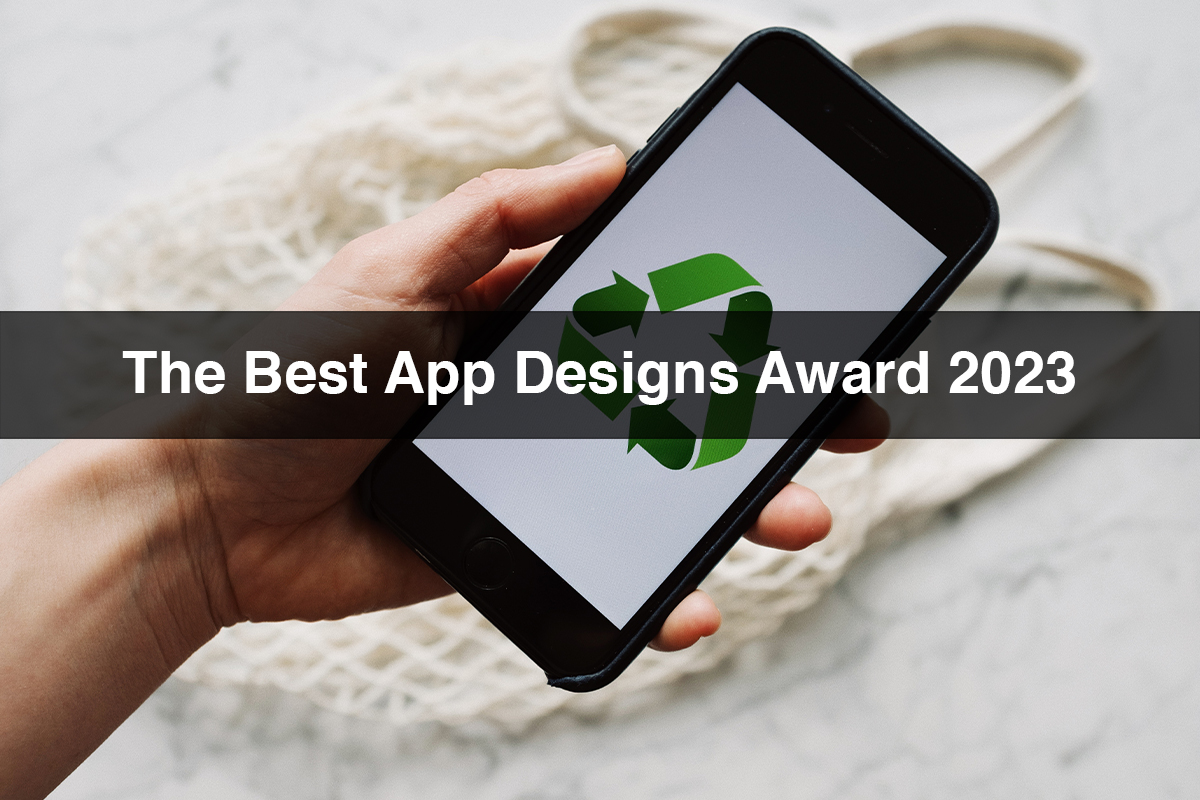
The Best App Designs Award 2023
Native apps were developed for the phone, and a little over a year later in 2008, the App Store was launched. Just a few years ago, most people on the planet didn’t even know what app design was, or even an app. The best app designs of 2007 looked like the work of a toddler compared to the best app designs of today.
Best app designs award
Unlimited images
The images we see in apps, such as product images, are designed to be displayed on a minute scale. For e-commerce and retail applications, products no longer need to be contained within a square or rectangle. Instead, they appear boundless and blend into the background, as if floating among the other design elements of the app. This offers the user a much more cohesive experience while using the app and unifies the app design.
Asymmetric menu and gallery
Using asymmetry in design and layout creates focus around certain elements in the app. People’s eyes often move in a certain direction when processing visual information, and creating an asymmetrical design can flow with the audience’s visual flow. We’re seeing designers flex their innovation muscles to avoid the slick feel of symmetrical apps, especially for multi-product gallery apps like e-commerce apps.
Boundaries define properties
Borders help organize information in your application design. In computing, early GUIs such as Apple Macintosh System 6 and Microsoft Windows relentlessly used borders to visually separate elements such as scroll arrows, buttons, and windows. Subtly referencing this period of early digital design, many apps connect with users through a nostalgic undertone.
Abstract spherical patterns
Part of their appeal is their fluidity, and when used in digital design, circles are known to give designs a nice, soft feel. Many incorporate circles into images and backgrounds. They draw on the abstract, quirky and nostalgic themes of 1980s Memphis Design using contrasting circles with zigzags and bright colors.
Non-traditional text alignment
For those targeting left to right audiences, designers create unconventional designs that feature vertically and diagonally aligned text. Challenging the way users traditionally perceive text in app designs, designers are using copy to incorporate it into other app elements.
Multi directional navigation
Rather than just scrolling up and down the features, these suggestions encourage the user to interact more consciously with the app. This is a particularly popular trend for applications with multiple products or profiles. Those offering podcasts, music or social media should bounce back from this point to enrich the content and allow the user to really get lost in the designs.
Brutalist app design
It’s a style known for being bold, direct and raw, and used by all sorts of niche alternative brands. Flat design, limited use of color and large text embody the disjointed aesthetic of Brutalism to stand out in a sea of conventionality those who deviate from the norm will appreciate the return of Brutalism in 2023.
Layered sheer screens
Layering clear screens over other design elements involves using drop shadows or blur effects on buttons and text fields to partially obscure the background image. This technique creates a refreshing, warm aura while creating page hierarchy, which is why it made our list of the best app design trends for 2023.
Conclusion
These top app design trends of 2022 focus on improving fun, usability, and overall experience. Whether you’re browsing social media or managing your account, apps are becoming a routine part of our daily lives.


